Is it a modal or a dialog? A toggle or a switch? A badge, a tag or a chip? If you have built UI with a team, you have had this argument, and it usually ends with whoever wrote the first file winning by default.
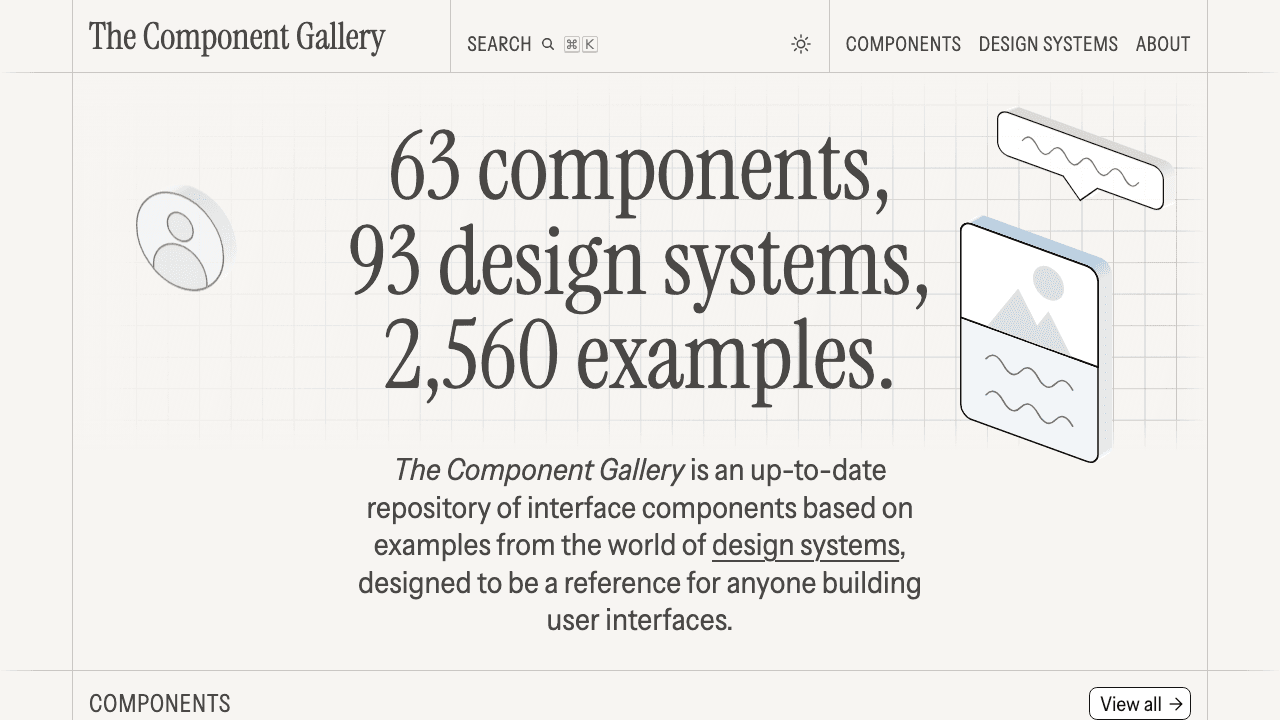
The Component Gallery is the best place I know to settle it. It is a free site that collects how real design systems build the same 60 components: 2,671 examples from 95 design systems, each linking back to the original docs. I went through every one of those examples on 13 October 2026 and counted what each team calls things. A modal is a "Dialog" in 25 of 82 examples. A toggle is a "Switch" more often than a "Toggle", 32 to 19. And alerts go by 42 different names.
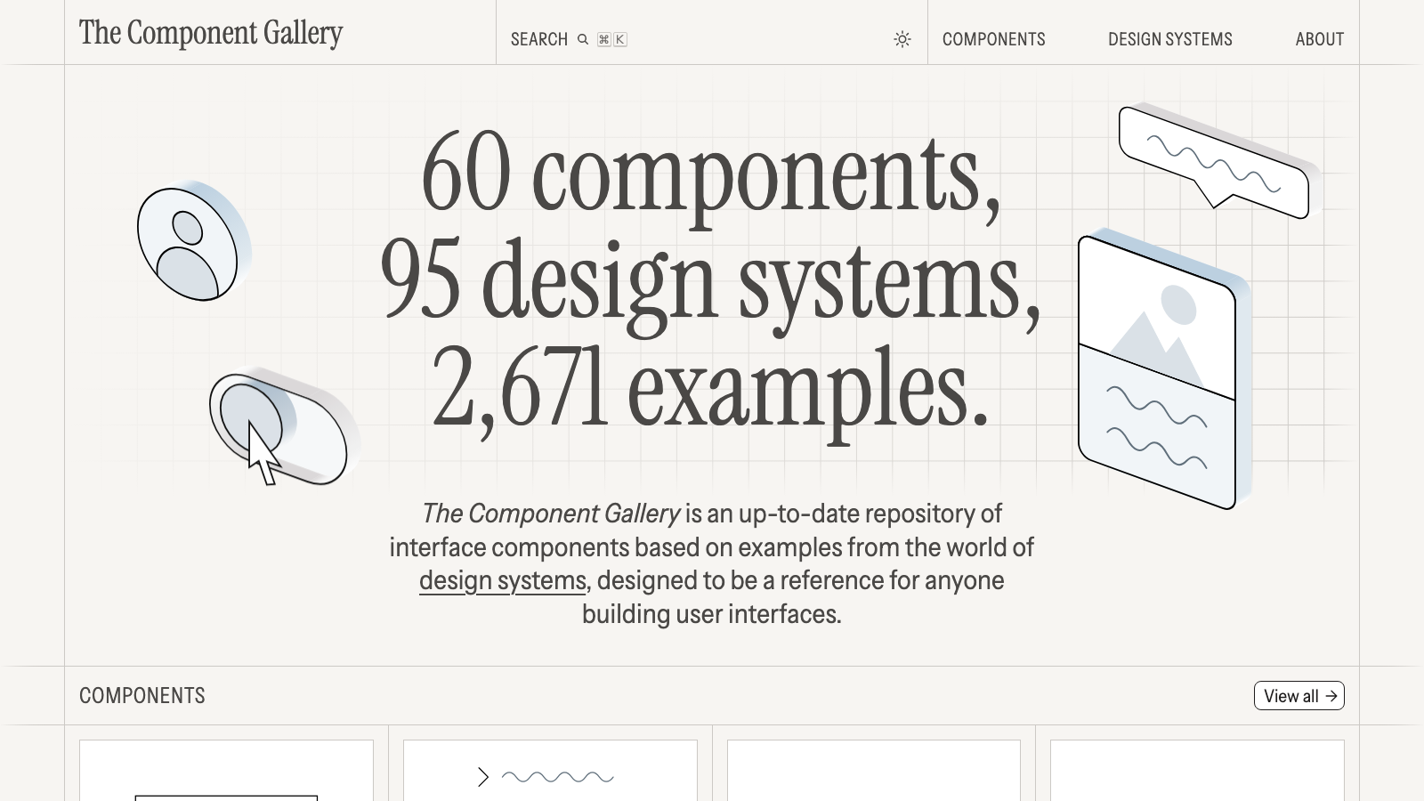
To be clear up front: I have not built a production component from it yet, so I can't tell you how much time it saves a team. This post is what the site holds, what the numbers say, and how I would use it before writing a spec or a prompt. No affiliate links. The site is free and needs no account.
What The Component Gallery actually is
Iain Bean, a front-end developer, has been running it since 2019. Open any component and you get a short definition, an "Also known as" list, and a grid of real examples from teams like Shopify, GOV.UK, Atlassian and Elastic. Twelve of the components also have a proper write-up on markup, behaviour and usage.
What it is not: a component library. There is nothing to install and nothing to copy-paste. The About page says it openly, most of these components are not ready to use off the shelf, and the point is to see how others solved the problem before you solve it yourself. I like that. It is research, not a shortcut.
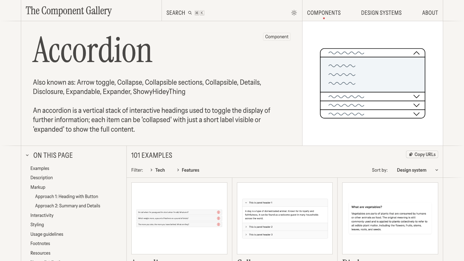
My favourite alias on the accordion page is "ShowyHideyThing". Someone shipped that.
Modal or dialog? It depends which library you grew up on
I grouped every example by the name its design system uses. These are the components where teams agree the least:
| Component | Examples | Different names | Most common |
|---|---|---|---|
| Navigation | 62 | 37 | Menu 7, Navigation 6, Navbar 5 |
| Alert | 108 | 42 | Alert 30, Banner 16, Notification 8 |
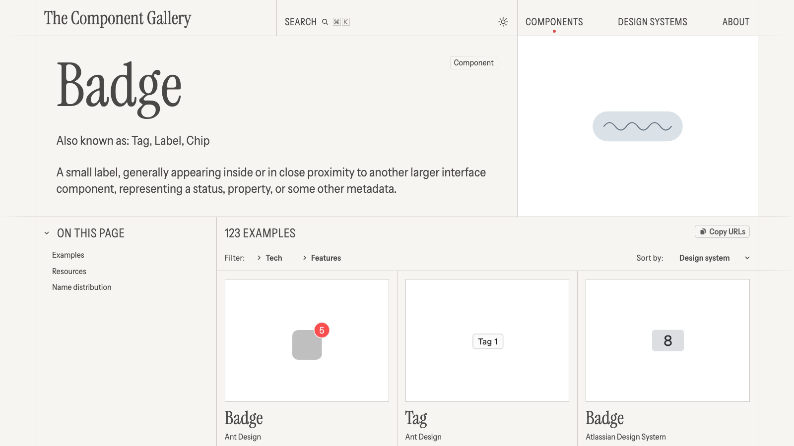
| Badge | 123 | 29 | Badge 45, Tag 32, Chip 8 |
| Dropdown menu | 49 | 18 | Dropdown 17, Menu 11 |
| Text input | 72 | 11 | Input 26, Text input 22, Text field 8 |
| Modal | 82 | 14 | Modal 42, Dialog 25 |
| Toggle | 60 | 8 | Switch 32, Toggle 19 |
The interesting part is where the split falls. Bootstrap, Carbon, Polaris and Ant Design say Modal. Radix, shadcn/ui, Headless UI, Chakra, Material and Primer say Dialog. Toggle splits along almost the same line. So if your stack is shadcn/ui or Radix, the argument is already over: it is a Dialog and a Switch, and calling it anything else just means translating in your head every time you open the docs.
Bean picks one name per page on purpose. In an old GitHub issue someone argued that "drop-down" covers a dozen different controls, and he answered that he tries "to balance familiarity with correctness". Fair enough. That is why Dropdown menu collects 18 names: it groups what a user would see as one thing.
Some names nobody argues about. Pagination is "Pagination" in 45 of 48 examples, Tooltip in 63 of 74, Avatar in 35 of 38. If your team is debating one of those, show them the count and move on.
A badge is three different components
Badge has more examples than Button, 123 to 118, and that surprised me until I looked at who ships what. 41 design systems have more than one badge-like component. Ant Design has a Badge and a Tag. Atlassian has a Badge, a Lozenge and a Tag.
Alerts are the same story. Atlassian has a Banner, a Section message, a Flag and an Inline message. Those are not four names for one thing, they are four jobs: a page-level banner, a message next to a form, a toast that goes away on its own.
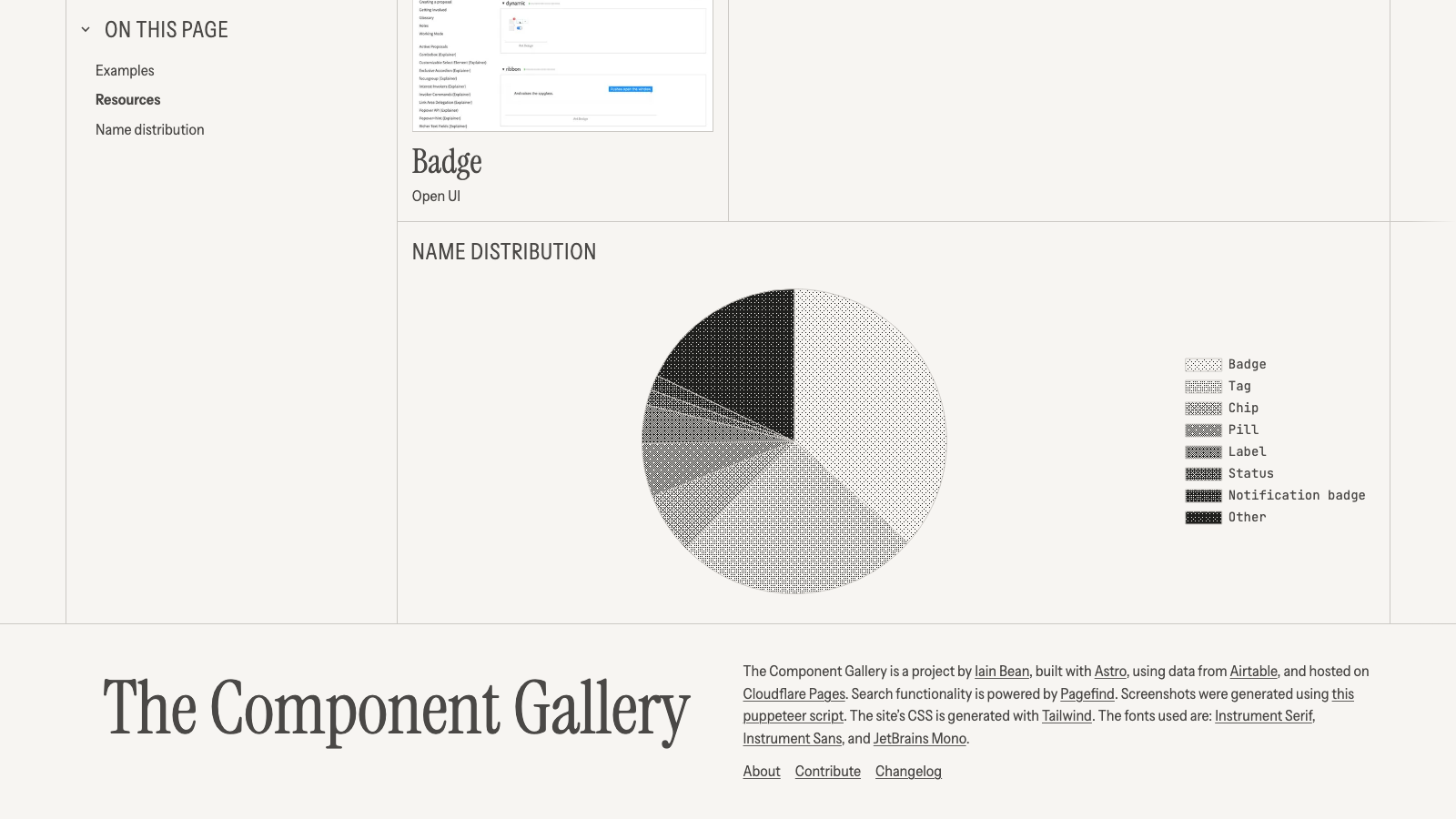
The lesson for your own code: "badge" in a ticket tells nobody anything. Say what it does. Does it show a count, a status, or a filter you can remove?
Which components almost every design system ships
Button is in 85 of the 94 systems that appear on component pages. Checkbox (80), radio button (79), alert (77), accordion (74) and tabs (73) are right behind it. At the other end there are only 5 rich text editors and 6 file components, so for those you are mostly on your own.
If you want one system to read end to end, Flowbite covers the most ground with 47 of the 60 components, then Elastic UI and PatternFly with 42 each.
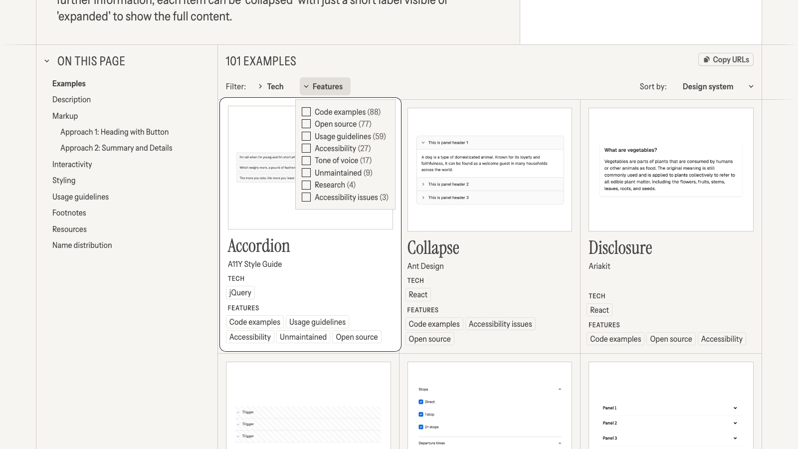
Two filters are worth knowing before you copy anyone's approach. 199 examples come from systems the gallery marks as unmaintained, and 140 are flagged with accessibility issues, including one of the three accordions flagged that way, Ant Design's Collapse. Filter those out and you are looking at teams that wrote their accessibility thinking down.
How I would use it before building a component
- Open the component and read "Also known as". Pick the name your library already uses.
- Filter by your tech (React, Vue, Web Components) and then by Accessibility. On the accordion page that takes 101 examples down to the teams that documented accessibility.
- If it is one of the 12 components with a write-up, read it. The accordion one compares a heading wrapping a button against the native
detailsandsummaryelements, which is exactly the decision you will face. - Hit "Copy URLs" and paste the examples into the ticket, so the reviewer sees what you looked at.
- Write the name and its aliases into the spec. If the spec goes to an AI UI generator like v0 or Lovable, use the name your component library uses. I have not tested how much the name changes what they generate, so treat it as good hygiene, not a proven trick.
Steps 1 and 5 matter most. The name you pick today ends up in your file names, your props and every ticket after it.
What's missing
- One person curates it. The 95 systems lean toward public web design systems. Mobile shows up on only 5 of them.
- Counts measure popularity, not quality. 42 teams calling it "Modal" tells you what people recognise, not what is accessible.
- Most pages have no write-up. 48 of 60 components are just examples, so you read each team's docs yourself.
- No export and no license. The data lives in a private Airtable and the GitHub repo has no license file. I scraped the pages to count, so ask the author before reusing the data.
- Updates have slowed. The last commit was on 12 June 2026, and requests to add Mantine, Base UI and Calcite are still open. If you build on one of those, you won't find it here yet.
None of that stops me from using it. For a free site run by one person, it does one job very well: it ends the naming argument with data instead of opinions.
Where to go next
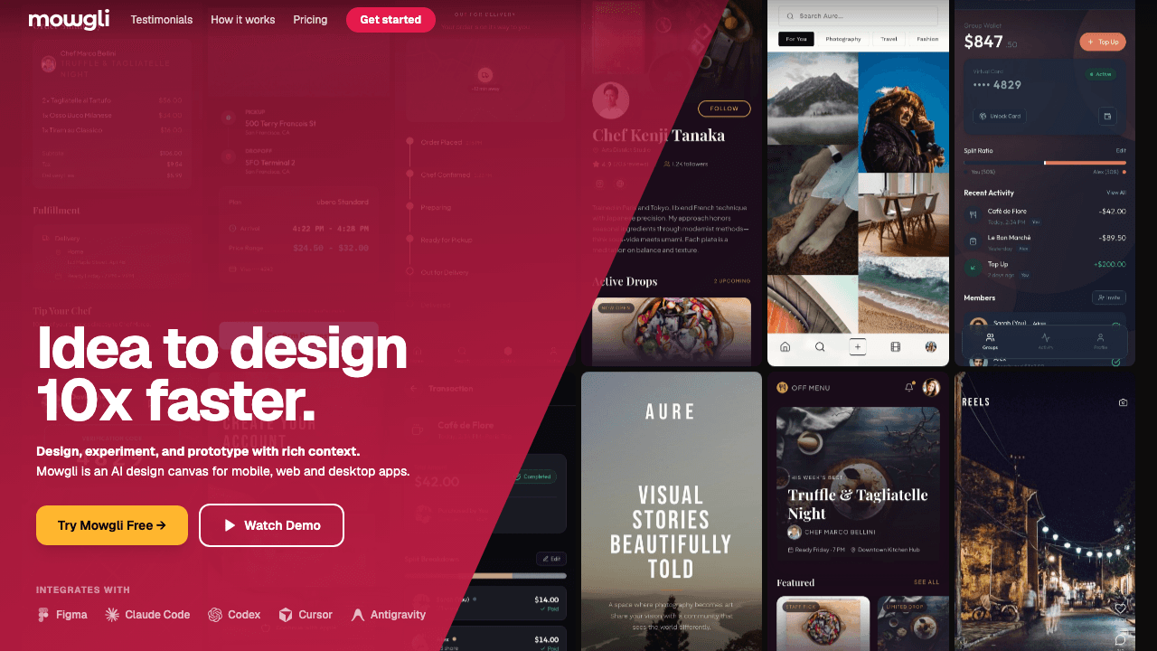
Our The Component Gallery listing has it as free with no sign-up. If you are going from names to screens, my Mowgli AI review covers a tool that writes the frontend spec next to the design, Lovable vs v0 compares the two generators people reach for once the spec exists, and Figma AI is the option if your design system lives in Figma.